14 Aug How to Design the Perfect Business Card for Your Medical Practice
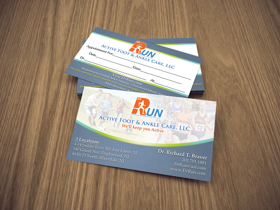
Marketing in the medical sphere can be difficult because it can often feel like promotional activities and conversion are out of your control. Business cards, which are far from outdated, can be incredibly effective if you know how to design them. Here are 6 tips to consider when designing the perfect business card for your medical practice.
- Forget the Fax. Business cards do get outdated if you put information on them that’s useless in today’s society! Ditch the fax number in place of a Facebook page.
- Be succinct. A clean, succinct statement can define your practice in an instant and set you apart from the competition.
- Create a Call. The point of a business card is to make conversions so be sure to include a call to action to encourage them to do just that!
- Don’t Forget the Back. A business card has two sides for a reason – don’t lose out on the valuable real estate on the backside! Many printers will print double sided for free, or with minimal charge, so just ask!
- Be Creative. If there’s nothing exciting or spunky about your card it’s going to be tossed in the trash without a second glance. Use bold colors, an interesting logo, and consider simple tweaks like angled text to draw the eye in.
- Legibility. Above all else, the card has to be legible. It doesn’t matter what you’ve written or what you offer if they can’t read it.


No Comments