11 Apr What Should a Medical Brochure Include?
Among all the printed materials in your medical office, the brochure is arguably the most crucial. What should a medical brochure include? Typically, it comes in a tri-fold or half-fold format, providing a brief overview of your practice, contact information, and aims to attract new patients. Unfortunately, many offices fail to create an effective brochure, which can harm their practice instead of helping it. Here are a few tips to ensure your medical brochure delivers the desired results.
Focus on Visuals, Use Fewer Words
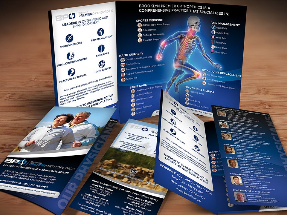
A common mistake in medical brochures is including excessive information on all procedures and conditions treated. In today’s fast-paced world, people are less inclined to read lengthy texts, especially if it resembles a miniature novel. Cramming an entire website’s worth of information into a small brochure, or using tiny font, is not the right approach. Instead, prioritize visuals and minimize text. Rather than writing a paragraph for each condition you treat, consider using bullet points. Incorporate visuals of the conditions or group them with related body part graphics. The brochure’s goal is to spark interest, increase awareness of your practice, and encourage readers to visit your website for more information or call to schedule an appointment.
Create an Engaging Cover with Smart Medical Brochure Design
Although it’s often said not to judge a book by its cover, the reality is that we are all drawn to books with captivating covers. This principle also applies to medical brochure design. Throughout our lives, we encounter numerous brochures, many of which are dull and forgettable. To stand out, incorporate engaging visuals in your medical brochure cover design. Generally, a single prominent image suffices, with minimal text. Include your logo, contact information, and a brief description of the brochure’s content.
The cover’s visual should communicate a relatable message to potential patients. Many medical brochures feature images of skeletons or specific body parts related to the practice. Instead, consider using images that resonate with your target audience. For instance, if you’re a spinal surgeon, an image of a middle-aged man playing with his child can be powerful, as chronic back pain can make simple tasks like these impossible. If you’re a podiatrist, consider a picture of someone walking barefoot on the beach. Patients with bunions, warts, or foot fungus often avoid going barefoot due to embarrassment, so this image suggests that your practice can help them overcome these life-altering issues. By paying attention to these medical brochure design elements, you can create a more impactful first impression.

Your cover should be simple, engaging and paint a picture and be relatable to your target patient. Something as simple as picking up a child can be extremely painful for someone with back or joint pain. This cover portrays a picture of a man truly living life without pain.
Opt for a Bigger, Bolder Medical Brochure Design
As mentioned earlier, we’ve all come across countless brochures in our lives, most of which share similar sizes and paper types. To stand out among the crowd, consider creating a bigger, bolder medical brochure design. We consistently advise clients to choose larger, thicker brochures, as they tend to attract more attention. Instead of the standard 8.5″ x 11″ size, explore larger dimensions like 8.5″ x 14″, 11″ x 17″, or 9″ x 16″. This subtle size difference can make your brochure stand out in a stack. Additionally, we recommend using a thicker material, such as card stock, which offers a sturdier feel and signals your commitment to patients’ well-being. While larger sizes and thicker paper may cost slightly more, the increase in new patients makes it a worthwhile investment.
Ensure Consistent Branding in Your Medical Brochure Design
Although it may seem obvious, it’s essential to maintain consistent branding throughout your medical brochure design. Your brochure should align with your practice’s overall branding. Feature your logo prominently on the cover, and consider placing it on the back as well. Additionally, use colors and fonts that match your logo and brand identity. For example, if your brand colors are blue and orange, avoid using green and red in your brochure. Similarly, if your logo features a modern typeface, don’t use a script font or Times New Roman. By ensuring a cohesive medical brochure design, you create a professional image that resonates with potential patients.

It’s important to brand your brochure. Your logo should be on the front of your brochure. In addition if your brand colors are blue and orange, there’s no reason to be using reds and greens.
Avoid Templates for a Unique Medical Brochure Design
Often, brochures can become an afterthought for medical practices, which might be preoccupied with treating patients rather than focusing on marketing. As a result, brochure designs may be hastily assembled, either by copying an existing brochure, using a cheap online template, or resorting to Microsoft Word’s built-in templates. These approaches can appear unprofessional and give the impression that your practice cuts corners, which may lead potential patients to question the quality of care they would receive.
To create a memorable and effective medical brochure design, consider partnering with a professional designer who understands the nuances of crafting a well-designed brochure. Work with a designer who can listen to your specific needs and create a custom brochure tailored to your practice. This investment in your marketing materials will not only enhance your practice’s image but also instill confidence in potential patients.
Need help creating the perfect medical brochure that will drive new patients to your practice? Graphics For Doctors has designed and printed hundreds of medical brochures for many satisfied clients. We strive to make sure the brochures we design are perfectly tailored to fit your practice’s needs and get more patience through your door. Need a brochure designed? Great! We’d love to help! Contact us by email or by calling 888-803-2021 to get started.


No Comments